
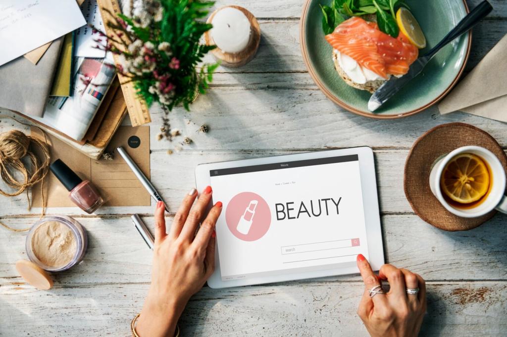


Case Story: A Campus LMS That Finally Clicked
Primary buttons buried below fold, videos overflowing containers, and quizzes designed for mouse precision. Evening commuters abandoned lessons frequently. Faculty felt helpless without a clear pattern library.
Case Story: A Campus LMS That Finally Clicked
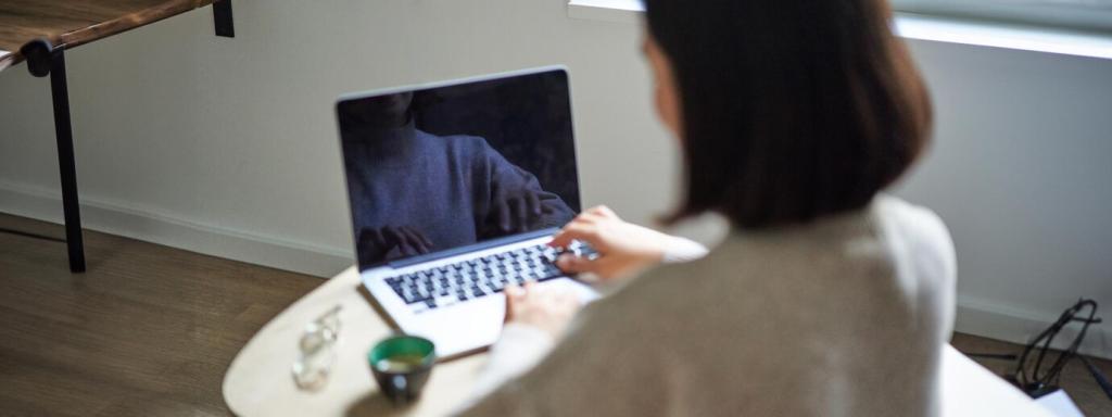
We introduced design tokens, a responsive component library, and a mobile-first authoring guide. Faculty previewed lessons in device frames and adjusted microcopy for small screens. Momentum built quickly.
Case Story: A Campus LMS That Finally Clicked
Median time-to-first-contentful interaction dropped, session length rose, and quiz completion increased. A student said, “I can finally study between lab sessions.” Want the playbook? Subscribe and we’ll send the full breakdown.
Case Story: A Campus LMS That Finally Clicked
Lorem ipsum dolor sit amet, consectetur adipiscing elit. Ut elit tellus, luctus nec ullamcorper mattis, pulvinar dapibus leo.